Windows 11 release date is near and due to this reason, developers working behind Chrome are doing their best so that their browser can adapt to the style of Windows 11 To get started they have picked the Chrome menus. Google has recently added a new feature in Chrome using which users can enable Windows 11-Style Menus in the Chrome browser. In case, you use Chrome as a default browser on your device and already using Windows 11 and liked the round corner UI for the context menu, then this change is worth trying.
Enable Windows 11-Style Menus in the Google Chrome
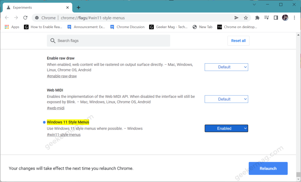
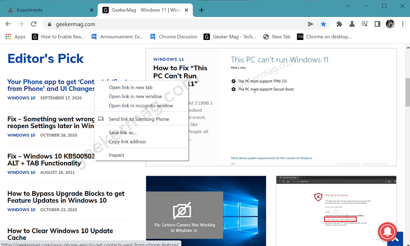
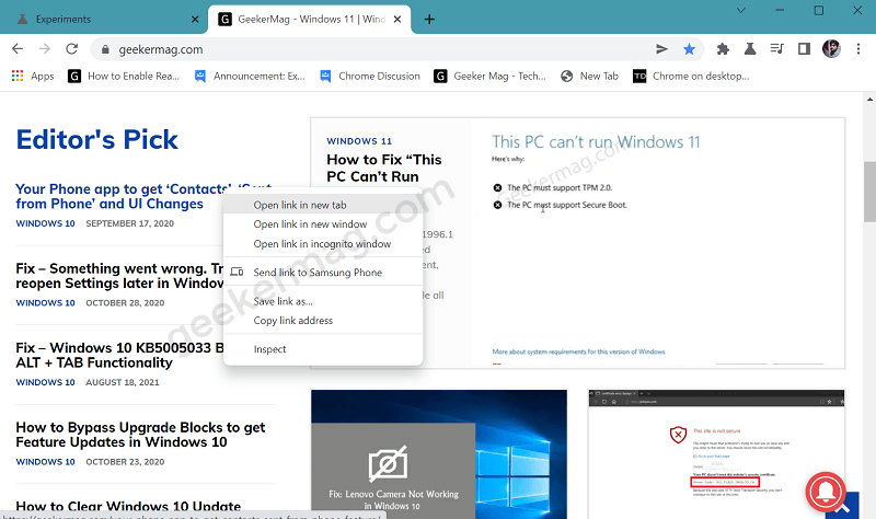
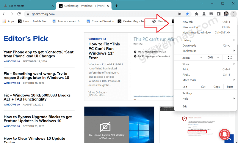
The option to enable Windows 11 Style context menu in Chrome is available behind the flags in the latest build of Chrome Canary. If you want to give it a try, then here’s how you can enable it: Launch Chrome Canary on your device and make sure you’re running the latest build. In the address bar, copy-paste this address: chrome://flags/#win11-style-menus and hit enter. This will highlight the feature flags i.e. Windows 11 Style Menus, using the drop-down to change the settings from Default to Enabled. Click on the Relaunch button to apply the changes. At this point, you have successfully enabled the Windows 11 Style menu in the Chrome browser. From now onwards, you will notice that all the context menus in Chrome that previously load with a square corner now open with round corners. Here’s a quick difference between the Native Chrome menu and Windows 11 Style Chrome menu: If you don’t know Microsoft Edge browser already adapt round corner UI for the context menu. It is highly possible that Google will try to add more UI changes to the Chrome browser to match Windows 11 UI. For example mica material effect, and more. Do you like Windows 11 Style menu in the Chrome browser? We would like to know your opinion in the comments.


